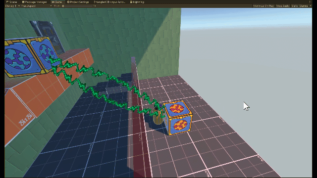
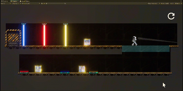
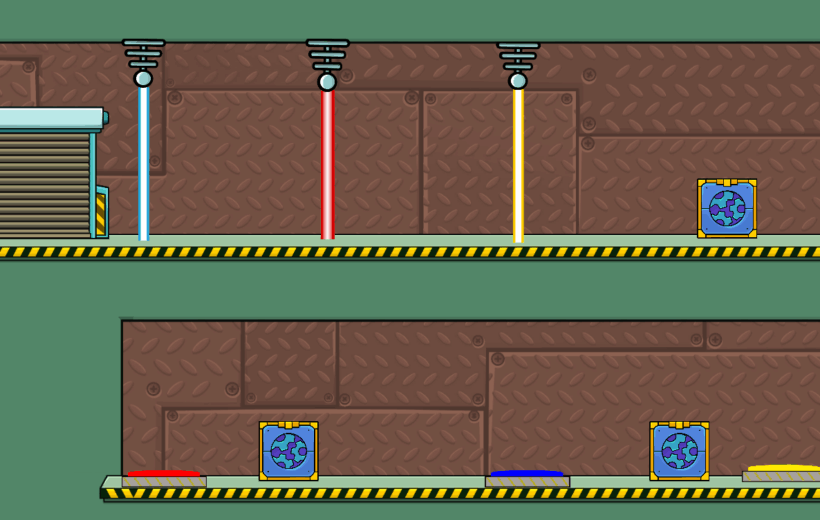
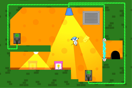
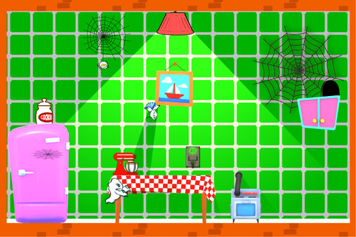
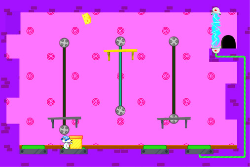
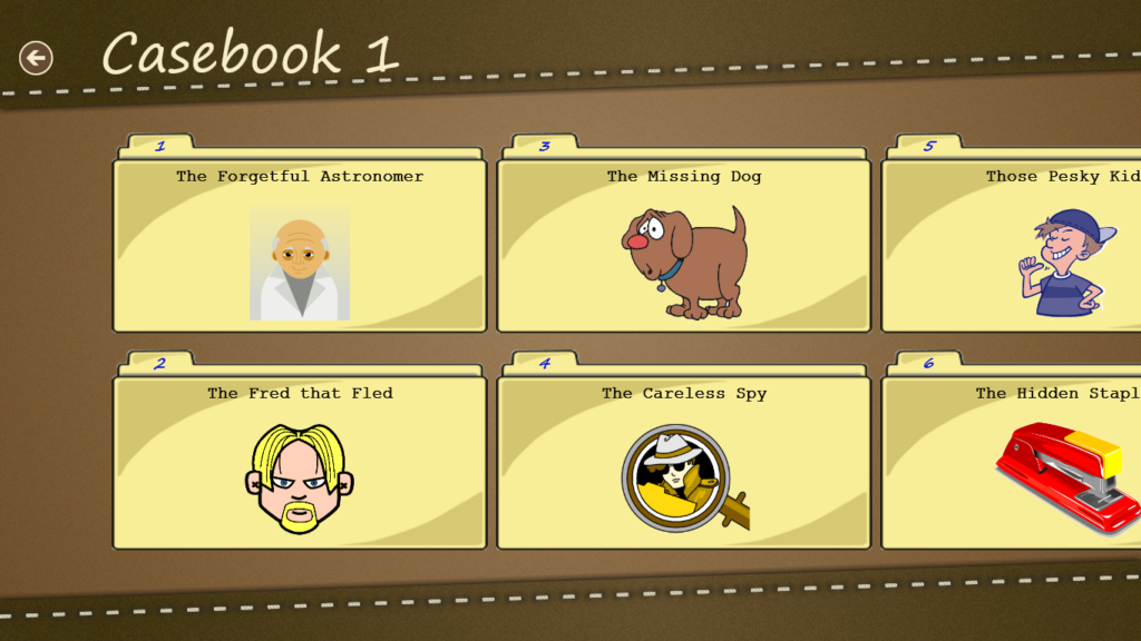
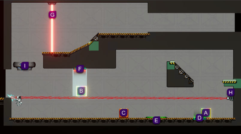
The Making of Mouse Dreams Part 2 – In One Level

In this article, I examine Mouse Dreams’ evolution of by following a single level from its initial design through to the final game.

1: Sketch

“Block light switch w/crate to open exit” says my awful handwriting.

That sketch is from the very first time I sat down to create what became the final design for Mouse Dreams (if you don’t count the discarded game from whose ashes Mouse Dreams arose). When I had arrived at the core game design (see Part 1 for the full story), I quickly sketched out the first 8 or so levels in a notebook.

In the sketch, the larger ‘square’ in the lower-left is the player. Next to the player is a box the player must carry onto the ledge on the right side to block the light (the thing near the top of the screen with two diagonal lines beaming from it) from hitting a light-sensitive switch that controls the moving wall (the rectangle with the downwards arrow near the bottom centre of the image), which is blocking the way to  the exit in the lower-right. If that’s confusing, it should become clearer when you see the level as it looks in the game further down.

This early level aims to teach the player about light-sensitive switches, and while the sketch is messy, it’s enough to encapsulate the ideas to transfer into the game.

My hints for sketching out levels:

  • Expect to forget what you were thinking when you drew it…write notes and draw arrows.
  • Use colour for different things.
  • Use a key for objects – e.g. the player is a square, a collectable is a pink triangle.
  • Don’t worry about scale – sketches are guides, and the final level will change numerous times anyway.
Another sketch – now in COLOUR

2: Prototype

Once I had my first bunch of levels, my enthusiasm was high. I had my game idea, and I had some content to get started with. I put my levels into the game with the rudimentary graphics I had at the time:

The first prototype of this level

This matches up closely with the original sketch. A collectable (the pink thing) has been added, and a more complex layout forces the player to jump around a bit.

With the sketch as a starting point, the level evolved as I built it. It felt too simplistic, hence the extra jumping required. I added the collectable because I decided that every level should have a collectable rather than just a few here and there.

3: Fleshing out the Prototype

I liked the idea of patterned wallpaper for some reason, and this led to turning the player into a Victorian-era man’s head with a hat and moustache. He rotated in mid-air when jumping.

In this version of the level you can see some changes that reflect the progression of the game design and the development of the game’s look.

I had decided that the game was set in houses, so I started replacing the abstract level geometry with chairs, shelves, and so on. While this looks quite different to the previous image, the actual layout is hardly changed – it just looks different.

The other major change here is that the crate has been moved. It is now closer to the light sensor it must be used to block. This is because I decided the player could not jump while carrying a crate.

Here is Level 1 from the same build that I think better gets across the game’s aesthetics at that stage:

A very early version of Level 1 with Victorian man and fancy wallpaper

4: Mouse

As is my tendency, I decided to make the game’s look more cartoony and fun. This was partly informed by the relative simplicity of the game – it was not the serious puzzle game I had first envisioned, but was more accessible with moderate difficulty, suitable for players of all ages.

I decided on a mouse theme to go with the cartoon aesthetic:

Putting the mouse (and cheese) in Mouse Dreams

5: Fleshing Out

As the game progressed, the visuals started to take shape after buying some assets. It took me weeks and lots of experimentation to get those bricks how I wanted. A subtle addition is the skirting along the bottom of the floor.

Getting better

6: Maturation

As the game matured, I released a beta version, and continually tweaked the look and feel to get closer to a final product. Much of this time period had been spent fixing bugs and implementing the game functionality, with the visual changes being mostly swapping out temporary assets for proper ones.

Here is the level as of that first beta:

Approaching the final look.

A few changes here:

  • Polish – the bricks now cover all of the main terrain, the wallpaper is more fitting to the cartoony theme, and the cheese is improved.
  • I have added a wire system to show the player which objects are powered by switches. You can see the red wire linking the light-activated switch to a place in the ground (where the moving wall is).
  • The box now starts in front of the light-activated switch. The trick here is that the player needs to move the box in order to climb on it and get the cheese, but doing so will close the moving wall that is currently open. This teaches the player to think less linearly, which will be required when the game gets more difficult.
  • The cheese is moved to increase the challenge. The player cannot reach the cheese without doing something else first. By this time, collecting the cheese is required before the player can exit the level.

7: Ramping up the Colour

During the beta period, I subjected my game for feedback, and among the comments, I received one particularly valuable suggestion: make the game more colourful. At first, I thought the advice was awful. My game had a fun, cartoony look! Didn’t it?

Stepping back, I realised the advice was perfect. I needed to push the brightness and saturation to an extreme. I also started commissioning what art I could afford, most notably a new main player character.

Bolder colours and a new mouse!

Due to some level shuffling, in this build the level was moved to the game’s second house, where it was House 2, Level 1.

The most obvious graphical change is the stylised, brightly coloured bricks (each house has different coloured bricks). The mouse’s night cap represents the game’s central conceit – that the protagonist is a sleeping mouse running around the crazy houses of his dreams. There are a lot more graphical improvements in the game by this point (along with new mechanics, new levels, and plenty of polish), though the early levels, such as this one, were not affected as much due to their simplicity.

8: Near Complete

And finally…

With the level moved back into the first house, the bricks have changed to that house’s colour – red. You can also see a trick I found to cheaply improve the looks – adding corner pieces to the ceiling for a less boxy shape.

As well as the bricks and wallpaper, you’ll notice some subtle changes to the chair, skirting, and shelf colours as well. I went through the game looking for anywhere I could ramp up the colour, and I tried to ensure each level had a good balance of colours – which is why the red wall is paired with a bright yellow wallpaper pattern in this level. With the orange chair and green shelf, most of the rainbow is represented here!

Here’s a different level with a few more details:

Another near-final screenshot.

Spot the Difference

Now that you’ve seen the final level, take another look at the original sketch back at the start. You’ll see the core level idea is still intact! The visuals developed over time, and some gameplay details changed. This level is a little more complex than it was originally because I made the cheese collection mandatory, and because I now require the player to undo their action in order to complete the level. But this level is still about teaching the player to use the light-detector switch mechanic.

The evolution of this level is a microcosm of the game itself. As development progressed, the style and theme gradually fell into place with lots of iteration and experimentation…and playing the levels over and over again…

Get Mouse Dreams

Check out the Mouse Dreams page for more info and store links.

1 thought on “The Making of Mouse Dreams Part 2 – In One Level

Leave a Comment